
Open half the advocacy motion packs floating through regional Slack channels and you will find the same disease: soft gradients, bouncy icons, friendly whoosh sounds, and a narrator explaining “how it works” as if justice were a project-management tool. SaaS explainer energy is optimized for onboarding a customer. Progressive campaigns need something closer to a newsroom: clarity under time pressure, evidentiary pacing, and graphic authority that does not giggle.
Neuwark Communications builds cinematic systems for political and public-interest work across the Philippines and APAC. Motion is not decoration on top of a message. Motion is how the message behaves when the feed is moving. If your kinetic type could sell CRM software with the logo swapped, you do not have campaign motion—you have rental UI animation.
Why SaaS motion seduces campaigns—and why it costs authority
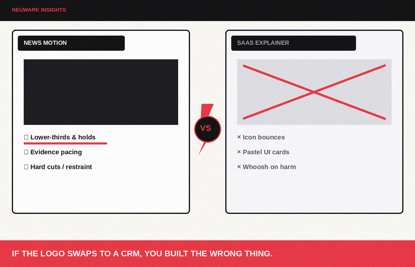
SaaS motion is abundant, cheap, and “modern.” Templates promise speed. Stakeholders like the polish. Platforms sometimes reward the completion rates of simple diagram stories. The hidden bill arrives in trust: audiences who live in scandal-saturated, meme-native information environments clock the mismatch. A flood-control accountability explainer should not move like a payroll app tour. A labor rights spot should not sparkle like a fintech reward unlock.
Common SaaS tells that leak into PH/APAC campaign work:
- Icon bounces and elastic eases on serious harm claims.
- Pastel UI cards presenting death, debt, or displacement.
- Infinite morphing arrows that imply tidy systems where the political reality is capture and friction.
- Stock illustration people with no place, class, or weather.
- Upbeat audio logos at the end of a moral claim.
Operator rule: motion should behave like reporting craft—lower-thirds, evidence callouts, map logic, clock pressure—not like product marketing.
Steal from newsrooms, not from onboarding
News motion traditions—done well—offer a better grammar for progressive authority:
1. Lower-thirds and chyrons that name people, places, and roles without theatrical flair. 2. Evidence plates that hold documents, figures, and timestamps long enough to be screenshotted. 3. Map and timeline logic that shows mechanism, not vibes. 4. Restraint in easing. Hard cuts and short dissolves often feel more honest than elastic overshoot. 5. Sound as information. Room tone, muffled hearings, rain, jeepney doors—then sparse score.
This is not a call to copy any one network’s vanity package. It is a call to adopt the epistemic posture of news packaging: we are showing you something that claims to be true; the graphics should look like they know that is a grave responsibility.
A motion system tied to message hierarchy
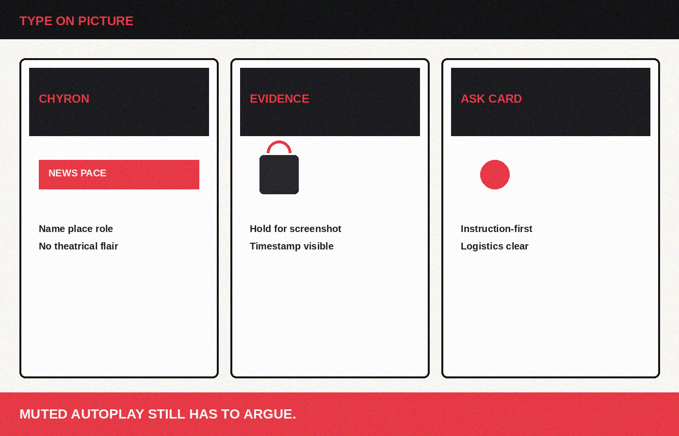
Build kinetic rules the same way you build a message system.
Frame motion. First 2–3 seconds: a concrete visual verb + a short line that states the problem story. No logo stinger before meaning. Logos can wait; confusion cannot.
Proof motion. Animate numbers and documents with enough hold time for verification culture—especially important where rumor economies on Viber/WhatsApp outrun official statements. If a figure pops for six frames and vanishes, you made a vibe, not a proof.
Contrast motion. Simple split screens, before/after plates, “claimed vs recorded” pairs. Avoid gimmick wipes. Let contrast be readable in silence.
Ask motion. End cards that behave like instructions, not brand monuments. Behavioral CTA, logistics, scannable URL or QR discipline for offline-to-online PH contexts.
Type on picture should match cinematic typography language: dark fields, crimson signal, grain-friendly weights, no candy gradients behind words that carry moral weight.
Pacing: respect the scroll without becoming a feature tour
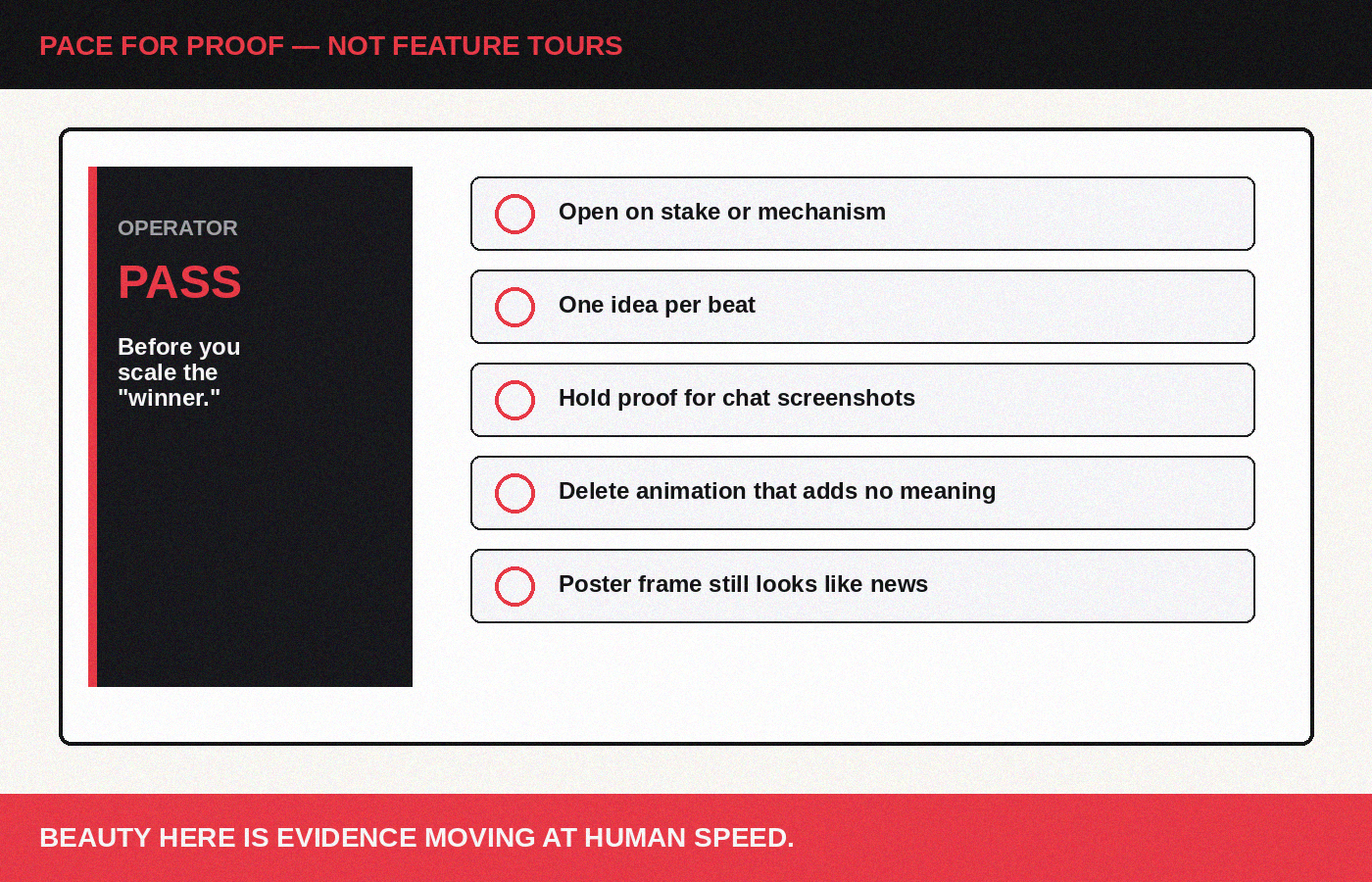
SaaS explainers pace like tours: feature, feature, feature, smile. Campaign motion should pace like argument: stake, mechanism, proof, ask.
Practical pacing notes for short-form:
- Open on consequence or mechanism, not on your org chart.
- One idea per beat; do not stack three charts in one second to look “smart.”
- Hold proof long enough for a screenshot—because that is how assets travel in chat networks.
- Cap decoration. If an animation does not change understanding, delete it.
- Design for muted autoplay: captions burned in with editorial care, not tiny afterthoughts.
For longer explainers (policy explainers, debate clips, hearing packages), use chapter cards sparingly. Chaptering is for orientation, not for turning politics into a course module with confetti.
Production constraints and coalition reality
Lean teams can still look like news:
- A small After Effects / CapCut kit with locked presets beats a new style every intern.
- Shared lower-third templates in Tagalog/English (and other vernacular as needed) with correct name order and honorifics.
- A forbidden list: bounce on grief, pastel on graft, whoosh on death tolls, mascot winks on rights violations.
- Film grain and slight gate weave on graphic packages that sit over documentary footage—so motion and picture share one world.
- Export checklist: safe margins, caption contrast, 9:16 and 1:1 masters, still poster frame pulled from the motion (see stills systems).
Coalitions should publish a motion bible beside the color bible. Otherwise every partner’s editor imports a different SaaS pack and the public hears visual noise.
Sound design: the fastest way to stop sounding like a product tour
Picture can be austere while sound still sells toothpaste. Ban the cheerful UI pops on harm claims. Prefer ticks, room tone, paper slides, muffled gavel, rain on tin, distant traffic—then a short tonal bed only when silence would lie. Voiceover should sound like a correspondent in the room, not a luxury narrator. In bilingual PH/APAC work, let vernacular rhythm lead kinetic type; do not force English corporate cadence onto Tagalog or other local lines just because the template’s timing was built for Silicon Valley explainers.
Pair motion with a poster frame discipline: every motion asset must yield a still that still feels like news when paused. If the only good frame is a mid-bounce icon, you built SaaS, not a campaign graphic.
The taste test before you publish
Ask three questions in the edit bay:
1. If we muted the music and removed the logo, would this still feel like a public claim rather than a product tour? 2. Could a hostile editor screenshot one frame and say we trivialized the harm—because of our motion choices? 3. Does any animation exist only because the template had it?
Two “yes” answers to (1) and clean “no” answers to (2) and (3) and you are close. Motion graphics for progressive work are not anti-beauty. They are anti-trivialization. Beauty here is the elegance of clear evidence moving at human speed.
If your campaign explainers look like they are selling seats to a dashboard, start a conversation with Neuwark Communications. We build motion systems that feel like newsroom authority for Philippine and APAC political and advocacy stages—dark enough to take stakes seriously, clear enough to move people to act.
[Start a conversation →](https://neuwarkcommunications.com/contact)