Progressive campaigns often inherit a color problem before they inherit a messaging problem. Someone opens a template pack. Blues mean trust. Greens mean climate. Yellows mean youth. Reds mean urgency—or someone’s uncle’s party memories. Three partners later, the coalition looks like a sticker sheet. The public cannot tell whether you are a movement, a webinar series, or a ride-hailing promo.
Neuwark Communications designs political and public-interest communications with a deliberate visual temperature: near-black fields, film grain, and electric crimson used as signal—not wallpaper. Authority is not a louder hex code. Authority is a color system with roles, restraints, and cultural literacy for the Philippines and APAC public squares where color carries history, faction, and class whether you planned for it or not.
Partisan-generic is a real aesthetic—and audiences can smell it
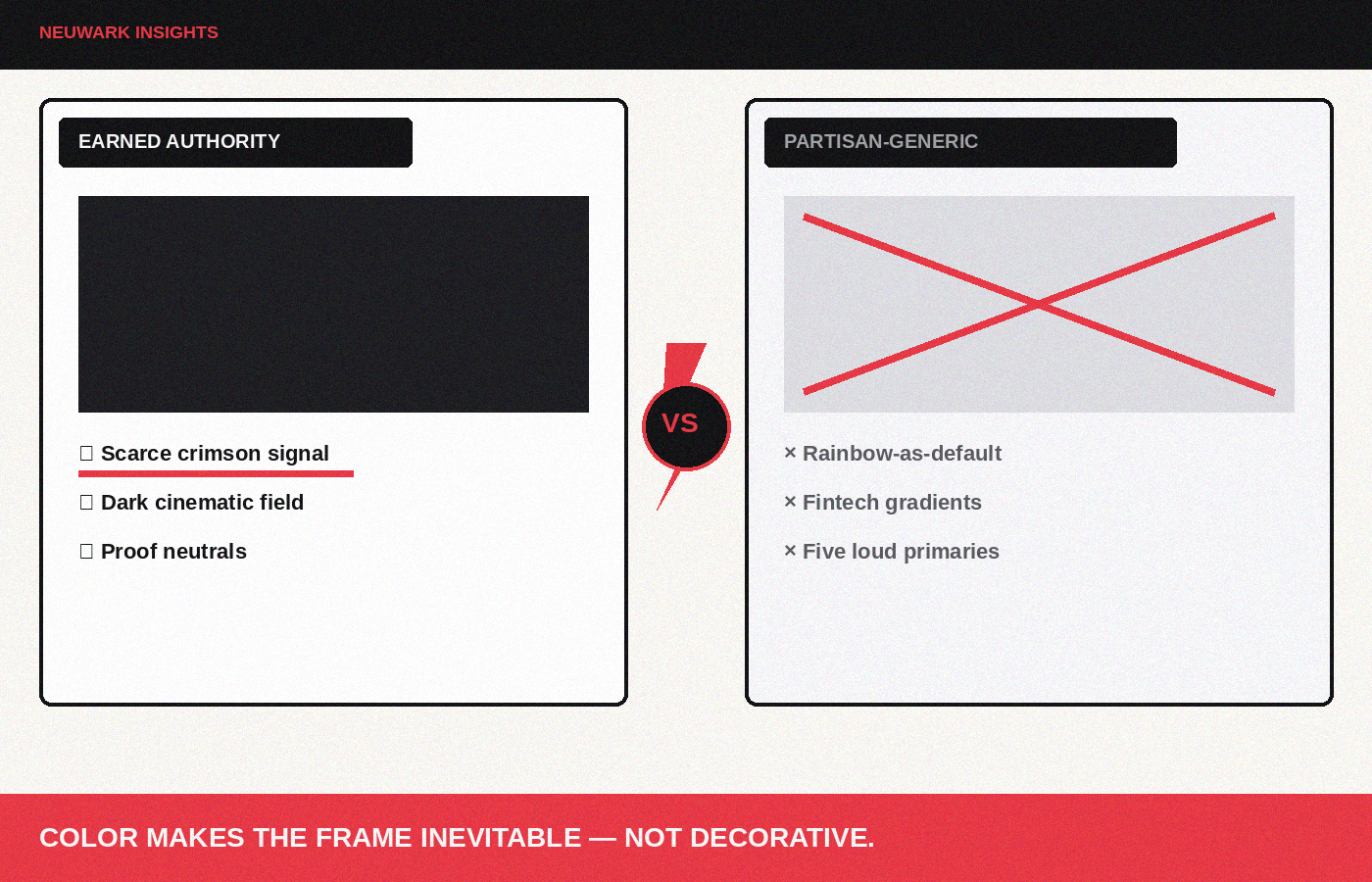
“Partisan-generic” is what happens when teams chase the idea of progressive without committing to a world. The symptoms are familiar:
- Rainbow-as-default for every justice claim, even when the campaign is about procurement, not pride.
- Soft gradient hero backgrounds that could sell fintech onboarding.
- Primary-color blocks borrowed from international NGO decks with no local light logic.
- Red used as panic siren in every banner until it means nothing.
- White space so timid the work feels like a hospital brochure.
In PH politics, color is never innocent. Hues echo parties, religious pageantry, barangay tarpaulins, and decades of visual propaganda. Across APAC, the same caution applies: what reads as “energetic progressive” in one market reads as factional cosplay in another. If your system cannot survive a black-and-white photocopy test and a culturally literate side-eye, it is decoration.
Operator rule: color should make your frame more inevitable, not more decorative.
Authority color behaves like editorial design, not team merch
Editorial and cinematic color systems do a few things merch culture does not:
1. They limit the accent. One decisive signal color beats five competing “brand pillars.” 2. They respect darkness. Dark fields create gravity; light becomes meaningful. 3. They assign jobs. Color marks hierarchy: headline signal, proof callouts, caution, neutrals for body. 4. They stay consistent under grain, compression, and cheap print. Tarpaulins and Stories should feel like siblings. 5. They avoid accidental faction uniforms unless you are intentionally entering that fight.
Electric crimson on near-black works as progressive authority when it is scarce and sharp—used for type, rules, key UI, and moral emphasis—not flooded across every panel like a clearance sale.
Build a system with roles, not a moodboard
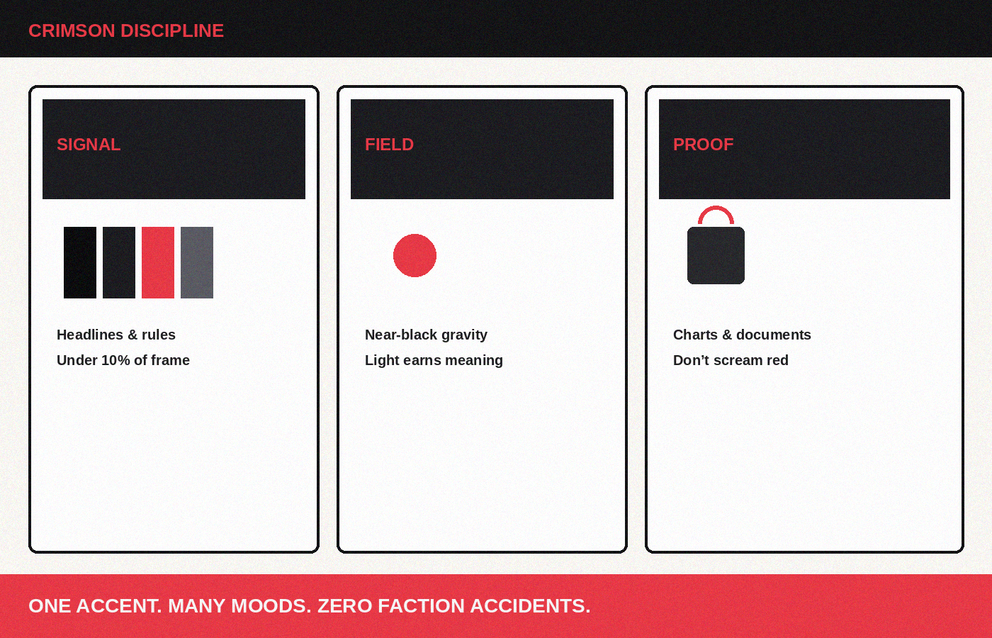
Write the palette like operations docs.
Signal. Your primary accent (for Neuwark-adjacent progressive cinema: `#e63946` crimson). Use for headlines you want remembered, key CTAs, underline rules, and sparse icons. If everything is signal, nothing is.
Field. Near-black / charcoal worlds for digital cinema; carefully chosen light fields for print readability in sun-blasted outdoor contexts. Field color sets emotional temperature more than accent does.
Proof. A secondary neutral-cool or warm gray for charts, document callouts, and data so proof does not scream in accent red. Screaming data looks like propaganda even when the numbers are clean.
Caution / consequence. A distinct treatment for warnings, deadlines, and harm callouts—often a restrained amber or a crimson variant used only in those modules—so urgency does not contaminate ordinary UI.
Human neutrals. Skin, environment, and documentary footage should not be force-graded into candy. Let places keep their sodium street glow, fluorescent offices, monsoon green-gray. Motivated color tells truth about location.
Cultural and coalition constraints in PH + APAC
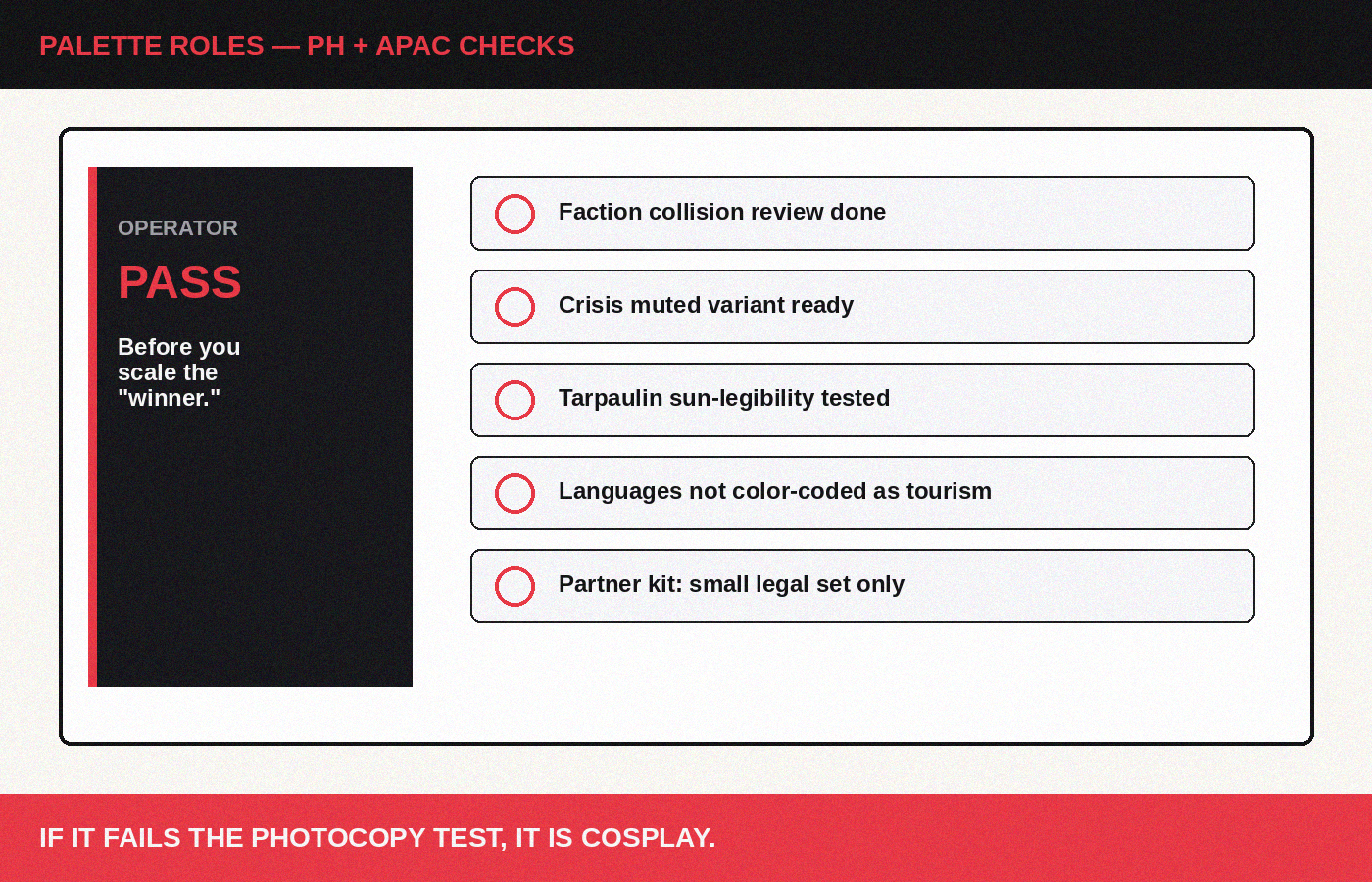
Practical checks before you lock a system:
- Faction collision review. Does your accent unintentionally mirror a party, fraternity, or rival coalition in the markets you contest? If yes, adjust temperature or pairing—not necessarily abandon the hue.
- Religious and ritual calendars. Saturation that feels “festive” can trivialize sober claims during mourning periods, disasters, or holy weeks. Build a muted variant for crisis weeks.
- Outdoor legibility. Philippine sunlight destroys delicate contrast. Test tarpaulin and print early. A cinematic dark UI that fails at the jeepney stop is not serious.
- Bilingual type color. Tagalog/English (and other vernacular) lines need equal dignity; do not color-code languages like a tourist brochure.
- Partner kit restraint. Give coalitions a small legal set: signal, field, two neutrals, do/don’t. Logo farms happen when every partner brings a favorite teal.
Implementation: from brand book to Tuesday assets
A color system only exists if paid, organic, events, and rapid response share it.
- Publish a one-page swatch + usage with hex/RGB and wrong examples.
- Define percentage discipline (e.g., accent under 10% of frame for most social).
- Pair color with type and grain rules so the system is cinematic, not flat corporate.
- Create crisis and celebration variants without inventing a new brand each time the news cycle turns.
- Train surrogates and chapter designers with three good examples and three forbidden ones—more effective than a 40-page PDF.
When testing creative, protect the signal color the way you protect the frame sentence. Testing a friendlier blue “because CTR” is often how movements accidentally join the bank-ad gravity well. Soft blue reassurance is a strategy, not a neutral default.
Case pattern: one accent across a messy week
Imagine a Philippine accountability week: a hearing clip on Monday, a carousel of contract pages on Wednesday, a provincial chapter tarpaulin on Friday, a diaspora IG story on Saturday. Without a color system, each asset invents its own urgency. With a system, the crimson signal marks the claim, the field keeps cinematic gravity, proof neutrals carry documents, and the crisis variant mutes celebration tones without inventing a second brand. Recognition compounds. That compounding is what unpaid media and paid media both need when attention is fragmented across Facebook, TikTok, YouTube, and chat forwards.
Also design for accessibility without surrendering cinema: check contrast for captions and end cards; do not rely on color alone to encode meaning; keep a monochrome-safe hierarchy so deuteranomaly or cheap phone screens do not erase your argument. Authority that only works on a calibrated studio monitor is cosplay.
What progressive authority looks like when color is working
You feel recognition before you finish reading. The feed looks like one fight, not twelve workshops. Dark frames take stakes seriously. Crimson arrives like underlining in an editor’s hand—precise, rare, impossible to ignore. Data sits in proof neutrals. People remain people, not tinted mascots. The photocopy still reads. The Story still feels like the hero film. The tarpaulin does not apologize for existing outdoors.
That is not aesthetic vanity. That is how belief becomes findable in a noisy public square.
If you are building progressive, political, or public-interest brands in the Philippines or across APAC and your palette looks like a template wearing a cause, start a conversation with Neuwark Communications. We build color systems that signal authority without collapsing into partisan-generic noise.
[Start a conversation →](https://neuwarkcommunications.com/contact)