Coalitions win what single logos cannot: labor plus youth plus faith validators plus local machines plus issue NGOs. Coalitions also invent a unique visual crime—the Frankenstein logo farm—where every partner mark is smashed onto a tarp until the public cannot find a face to trust. In Philippine campaign culture, where stickers, streamers, and Facebook headers are the real brand book, logo soup is not a minor design fail. It is a strategy fail that reads as “no one is in charge.”
Neuwark Communications designs coalition identity as a message system with a visual spine: one public face, clear partner hierarchy, and creative rules that let allies show up without erasing themselves—or you.
Why logo farms happen (and why organizers defend them)
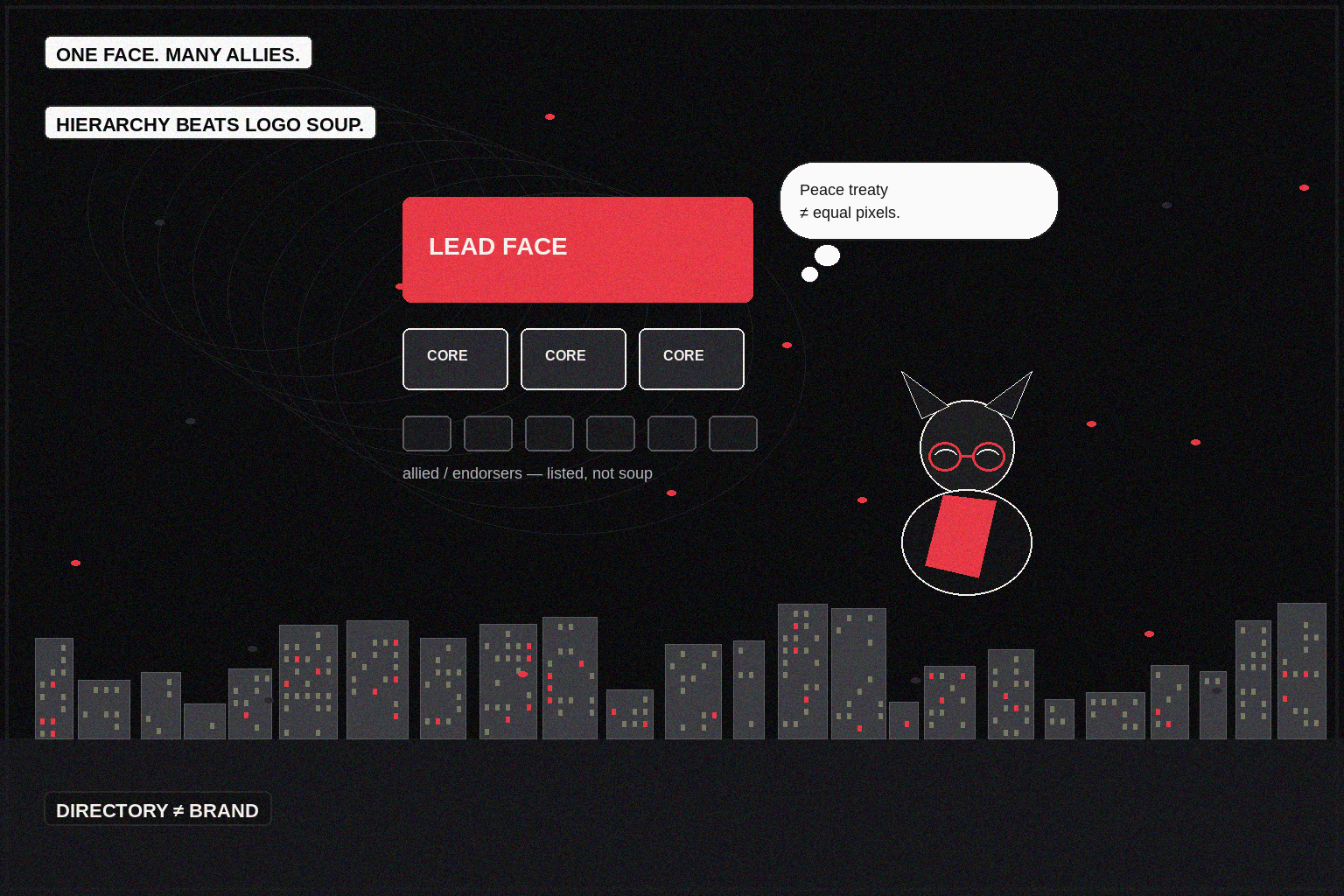
Logo farms are political peace treaties. Every partner wants proof of presence. Designers are told “just add them.” The tarp becomes a UN roll call. On a jeepney sticker, the marks shrink into confetti. On a stage LED, they compete with the candidate’s name until nothing is memorable.
Organizers defend the farm because exclusion feels like betrayal. Fair. The fix is not fewer partners. The fix is tiers and roles so inclusion does not equal equal visual weight.
Operator rule: if every logo is primary, you do not have a coalition brand—you have a directory.
Brand is the shared sentence made visible
Before typefaces and marks, lock the coalition’s shared sentence: the frame all partners can say without lying about their own mandates. If labor’s sentence and the climate NGO’s sentence only overlap in vibes, no designer can save you. Visual chaos is often strategic disagreement wearing CMYK.
In APAC progressive work—anti-corruption alliances, health access coalitions, climate adaptation blocs—the shared sentence is frequently issue-first, face-second. Candidate coalitions invert that. Do not copy-paste kits across those two realities.
The hierarchy that prevents Frankenstein
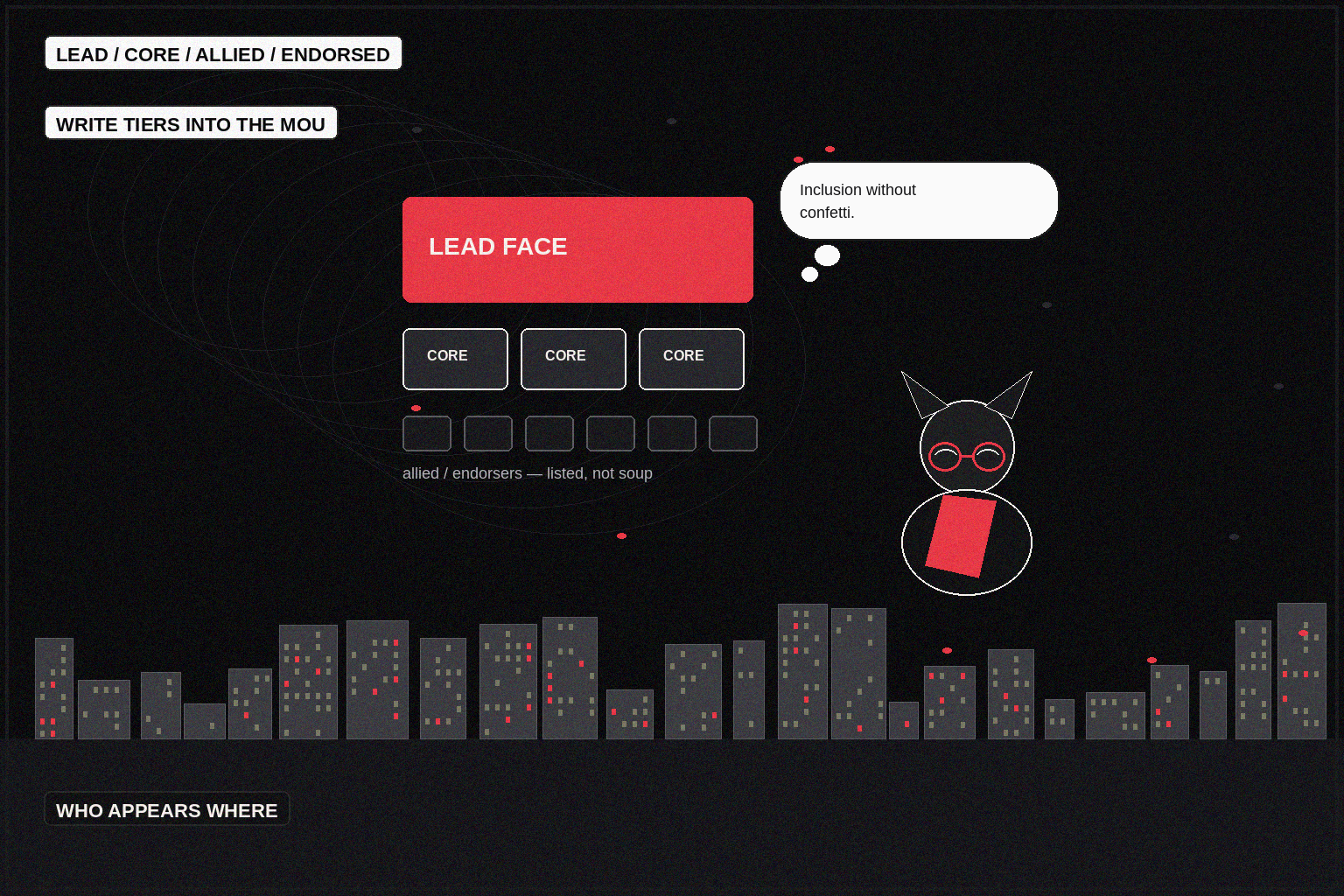
Write tiers into the MOU, not the Canva file:
1. Lead brand — the public face (candidate, ballot name, or campaign noun). Owns color, type, photographic grade, and master slogan. 2. Core partners — 3–5 marks that can appear in primary lockups on major assets. 3. Allied partners — listed on web/partner pages, selective event materials, not every streamer. 4. Endorsers — names and quotes; logos optional and never mandatory on field merch.
Publish a one-page who appears where matrix: stage backdrop, field shirt, digital avatar, press kit, door hanger, horizontal video end card. Ambiguity is how someone “just adds” twelve marks at 11 p.m. before a rally.
Creative systems beat one-off collages
Give partners a kit, not a scavenger hunt:
- Master logo + clear space + do-not stretch rules.
- Color tokens anchored on your crimson/dark cinematic system if that is the campaign face—or a coalition neutral if the face is issue-led.
- Photography direction: documentary grade, not stock handshake theater.
- Type ladder: one display serif or strong sans for the public face; partners keep their marks but do not bring five extra fonts into joint ads.
- Lockup recipes: lead-only; lead + core row; event-specific partner spotlight (rotating, not simultaneous).
Rotating spotlights solve ego without soup. Partner A gets the Tuesday Reel cosign; Partner B gets the Thursday assembly banner line. Equality of dignity does not require equality of pixels on every asset.
Field, digital, and paid: three densities, one face
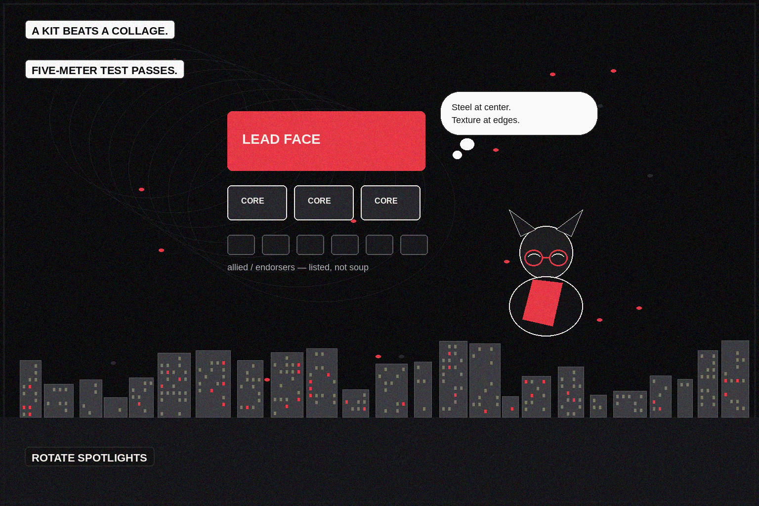
Field needs recognition at five meters: name, color, one symbol. If volunteers cannot identify the campaign from across a covered court, your coalition is failing the eye test.
Digital needs recognition at mute scroll: end cards with lead brand dominant; partner tags in copy and mentions, not a footer of unread marks.
Paid needs consistency for learning systems. Algorithmic delivery punishes creative that changes identity every flight. If each partner insists on a unique frame for “their” audience, you fragment frequency and look like competing advertisers who happen to share a hashtag.
GEO note: local landing pages for coalition events should keep one H1 identity and list partners below the fold. Search users hunting “who is behind this” deserve clarity, not a PNG graveyard.
Conflict moments will test the brand more than launch day
When a partner scandals, overreaches, or freelances a message outside the shared sentence, your visual system needs a separation protocol: how quickly the lead brand can stand alone, how partner pages update, what gets pulled from paid. Brand architecture is crisis architecture.
Same for success: when a partner’s issue spikes (a wage fight, a flood week, a campus vote), spotlight kits should already exist so you can elevate them without rebuilding the farm overnight.
Culture without erasure
Coalition branding fails when the lead face colonizes partners—or when partners colonize the lead. Progressive coalitions in the Philippines often carry vernacular pride, sectoral symbols, and regional texture. Fold those into photography, murals, and chapter-level materials. Keep the master mark stable. Texture at the edges; steel at the center.
Avoid the opposite aesthetic crime too: sterile “neutral” coalitions that look like a bank CSR deck. Dark cinematic craft with disciplined crimson accents can feel serious and alive without becoming a circus. Alive is not the same as cluttered.
A coalition should look like a band with a front person—not a sticker book. Partners deserve honor. The public deserves a face. Your job is to design the difference.
Naming, nouns, and the ballot problem
Visual hierarchy fails when naming hierarchy is unsettled. Is the public noun the candidate, the slate, the issue campaign, or the coalition title? Pick one primary noun for outdoor and avatars. Secondary nouns live in subheads and partner pages. Philippine ballots and sample ballots already tax voter working memory; your tarp should not add a second exam.
For advocacy coalitions without a single face, invent a campaign noun with teeth—“Flood Accountability Now,” not “Multi-Stakeholder Integrity Platform.” Then protect it like a candidate name. Partners can endorse the noun without replacing it.
Merchandise and the five-meter test
Run a literal five-meter test in a covered court: shirt, hat, sticker, streamer. If a volunteer cannot shout the name after a glance, redesign. Crimson accents on dark grounds help recognition under bad lighting—the same cinematic logic as your digital feature world, compressed for cloth and tarpaulin ink realities.
Avoid anniversary-style commemorative layouts for weekly field drops. Commemorative energy is how every seal and QR accumulates. Weekly field is ruthless: face, color, ask.
Governance beats taste debates
Install a brand desk with veto power on joint assets—ideally strategy-adjacent, not only a junior designer absorbing everyone’s trauma. Partners submit via a short form: asset type, tier justification, deadline. Silent adds to the master file are treated as incidents, not quirks.
When taste conflicts escalate (“our red vs your red”), return to the shared sentence and the lead-brand rule already in the MOU. Taste is infinite. Hierarchy is finite. Coalitions that cannot honor a signed hierarchy will not honor a message frame under attack either.
Neuwark Communications builds coalition brand systems for political, advocacy, and institutional alliances across PH and APAC—message hierarchy first, visual hierarchy second, ego management always. If your current “brand” is a folder of logos and a prayer, start a conversation with us before the next tarp goes to print.
[Start a conversation →](https://neuwarkcommunications.com/contact)